Client / Program
Prudential
Prudential
A responsive digital experience designed to simplify life insurance decision-making through clearer guidance, self-service tools, interactive calculators, comparison flows, and educational content.
Client / Program
Prudential
Role
Sr. UX/UI Consultant
Product
Web / Responsive
Industry
Financial Services / Insurance
Prudential faced a common challenge in the life insurance space: consumers often found insurance products complex, jargon-heavy, and difficult to compare.
As Sr. UX/UI Consultant, Jorge supported the redesign of a digital experience focused on helping users better understand their options, navigate life insurance and small business insurance offerings, and use self-service tools to make more confident decisions.
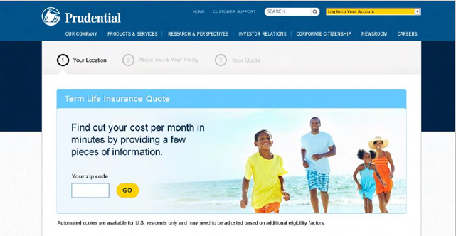
The work included responsive web design, educational content, interactive calculators, projection models, comparison tools, and decision-support flows intended to reduce friction in the insurance exploration and purchasing journey.
Prudential needed to improve the clarity and usability of its digital experience so consumers could better understand insurance options, compare products, and make more informed decisions with less dependence on assisted support.
The life insurance industry has long been perceived as complex and daunting, especially for consumers making high-stakes decisions about their financial futures.
Prudential faced a significant business challenge: users were struggling with clarity and confidence when navigating life insurance and small business insurance options.
This created increased dependence on call centers and assisted support, revealing a gap in digital self-service capabilities.
The mission was to transform the digital experience so users could better understand product options, evaluate tradeoffs, and move through the decision-making process with greater independence.
As Sr. UX/UI Consultant, Jorge supported a multidisciplinary team responsible for redefining Prudential's digital life insurance experience.
His role included visual design, interaction design, user-centered design strategy, stakeholder collaboration, and coordination with product managers, developers, and business stakeholders.
He helped translate complex insurance concepts into clearer digital flows, supported self-service decision-making, and ensured that design solutions aligned with both business strategy and customer needs.
The work followed a research-led, structure-first design process with continuous validation. The approach emphasized research over opinion, structure before surface, and continuous usability validation.
Frame - Align and define
Discover - Research and empathize
Structure - Information architecture
Ideate - Explore concepts
Interact - Optimize flows
Design - Visual and systems
Validate - Test and reduce risk
Launch - Build and QA
Improve - Measure and learn
The team used a mixed-methods research approach to understand user challenges and preferences.
Research activities included user interviews, usability testing of current digital offerings, and competitor analysis.
Key insights showed that users often felt lost in the insurance purchasing journey, citing confusion around jargon, unclear product differences, and a lack of straightforward guidance.
By synthesizing qualitative feedback with available analytics, the team identified pain points that informed design strategies and reinforced the need for clearer educational content and decision support.
The information architecture strategy focused on simplifying the insurance journey through clearer categorization, user-friendly language, and navigational paths aligned with user expectations.
The team prioritized plain language over jargon, introduced educational resource structures, and organized content to support easier comparison and decision-making.
This structure helped demystify insurance products and gave users clearer pathways through complex product information.
Prototyping was central to the methodology, ranging from low-fidelity wireframes to high-fidelity clickable prototypes.
The team conducted usability testing with target users to gather feedback on comprehension, navigation, and interaction patterns.
A/B testing methods were also used to validate design decisions against user preferences and refine the experience through iteration.
The design process went through multiple iterations informed by user feedback.
Initial prototypes highlighted issues around navigation clarity, content overload, and decision-making friction.
Subsequent versions streamlined interactions, prioritized essential information, and introduced interactive calculators and comparison tools that gave users more control over the evaluation process.
The design work supported Prudential's goals around improving digital self-service, making complex insurance products easier to understand, and reducing friction in the insurance decision-making process.
By introducing clearer educational content, responsive journeys, interactive calculators, comparison tools, and decision-support flows, the experience helped users evaluate options with greater confidence and reduced reliance on assisted support.
Insurance experiences require clarity, trust, plain language, and guided self-service because users are making complex, high-stakes financial decisions. Strong digital guidance helps people understand options, compare tradeoffs, and move forward with greater confidence.