Client / Program
T. Rowe Price
T. Rowe Price
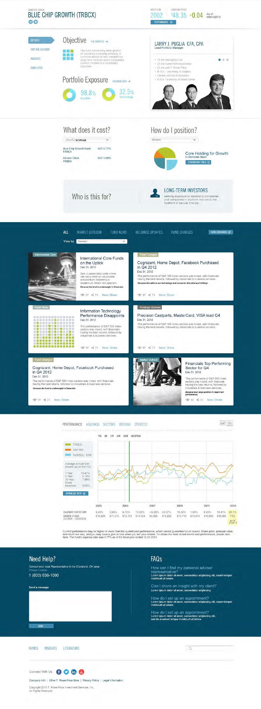
A web and mobile investor platform designed to make complex financial data easier to understand through clearer dashboards, insight cards, drill-down models, visualizations, and decision-support tools.
Client / Program
T. Rowe Price
Role
Sr. UX/UI Consultant
Product
Web / Mobile
Industry
Financial Services / Fintech
Scale
5-person cross-functional team
T. Rowe Price faced a challenge common in high-end investment experiences: users needed access to deep financial information, but dense data and complex interfaces could make it difficult to identify the right insights quickly.
As Sr. UX/UI Consultant, Jorge supported the design of a web and mobile investor platform focused on clearer data visualization, more intuitive drill-down patterns, bite-sized insight cards, and decision-support tools.
T. Rowe Price needed to help high-end investors navigate and interpret large volumes of complex financial data. The objective was to create a clearer, more usable web and mobile platform that could surface meaningful insights, support decision-making, and balance simplified data presentation with the analytical depth sophisticated investors require.
High-end investors often need to navigate large volumes of complex financial data to make informed investment decisions.
The strategic challenge was creating clarity and usability within dense, technical information while preserving the depth necessary for analysis.
The experience needed to help users move from high-level portfolio insights to detailed analytics without feeling overwhelmed.
The core design problem was balancing simplicity and depth: reducing cognitive load while still supporting sophisticated financial decision-making.
As Sr. UX/UI Consultant, Jorge worked with a cross-functional team that included data analysts, designers, and software engineers.
His responsibilities included UX strategy, interaction design, visual design, stakeholder collaboration, ideation facilitation, and translating user needs into actionable design requirements.
The role required aligning investment user needs with business goals while helping shape interaction models for data-rich financial experiences.
The work involved a 5-person cross-functional team. Collaboration was primarily on-site, supporting close coordination between data analysts, designers, engineers, and stakeholders throughout research, prototyping, testing, and refinement.
The work followed a research-led, structure-first design process with continuous validation. The approach emphasized research over opinion, structure before surface, and continuous usability validation.
Frame - Align and define
Discover - Research and empathize
Structure - Information architecture
Ideate - Explore concepts
Interact - Optimize flows
Design - Visual and systems
Validate - Test and reduce risk
Launch - Build and QA
Improve - Measure and learn
The research approach combined qualitative and quantitative methods.
The team conducted in-depth interviews with high-end investors to understand pain points, behavior patterns, and expectations around financial data access.
Surveys and broader insight gathering helped identify the need for concise data summaries, robust filtering, and drill-down capabilities.
Users expressed a preference for visual representations that could help them move quickly from summary-level information to deeper analysis.
The information architecture strategy focused on creating a user-centered framework that prioritized accessibility, intuitive navigation, and progressive disclosure.
The team structured content around investor needs, defined clearer paths for data exploration, and created hierarchical models that allowed users to drill down from high-level insights to detailed analytics.
This structure gave users more control over the complexity of information while preserving analytical depth.
The team used an iterative prototyping process, starting with low-fidelity wireframes and progressing to high-fidelity interactive prototypes.
Usability testing sessions with representative users helped evaluate functionality, clarity, and ease of use.
Feedback from testing informed refinements before implementation, grounding the design in observed user behavior.
The design process went through multiple iterations based on user testing feedback.
Users highlighted the need for more interactive elements, clearer visual representations, and stronger decision-support tools.
These insights led to refinements in data visualization, dashboard hierarchy, insight-card behavior, and drill-down interactions.
The design work supported T. Rowe Price's goals around improving investor clarity, strengthening cross-device access, and making complex financial data easier to interpret.
By focusing on digestible visualizations, insight cards, drill-down models, and decision-support patterns, the platform helped investors move through complex information with greater confidence and control.
Investor platforms must help users move from dense financial information to clear, trustworthy insight without stripping away analytical depth. Strong financial UX gives users a path from summary to detail while keeping complex data understandable and actionable.